
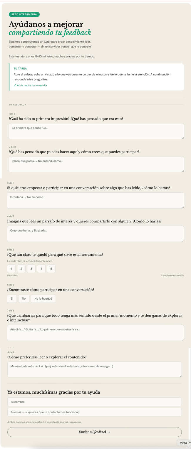
Goals of this surveys:
What they'd see (first impressions + community)
What they'd do (participarte + share)
What they'd need (product-market fit)
Target users:
Students between 25-30 years old.

Highlights and insights
🧑🏻💼 🙋🏻♀️ 5 users response
"Destacar el mensaje clave para que atraiga al lector que lo lea antes de explorar el sitio web. También haría una sección con los artículos donde más gente participó, por ejemplo, top 10 Ínteractuaciones."
First impression — unclear product identity
All 5 read it as something familiar but couldn't place it precisely: blog, forum, educational platform, WordPress-style site. Nobody landed on "living knowledge base" or anything close to Seed's actual value prop.
Clarity score — 4/5 average (range 3–5)
Decent but not strong — and the one 3 came with the most passive experience. Nobody gave a 5 except Martyna, who already came in with a collaborative framing. This suggests the product is legible enough to explore but not immediately clear in purpose.
Sharing — instinct is screenshots and copy-paste, not the link tool
The core Seed mechanic (shareable link to any paragraph) isn't surfacing itself as the obvious action.
Most defaulted to screenshot or copying text manually. Two noticed the paragraph link icon but only after looking — one said it directly: "I'd like a more direct way."
Copiaría el texto del párrafo, haría una screenshot o seleccionaría el párrafo, después haría clic en el icono de la cadena para copiar el link y compartirlo. Pero me gustaría que hubiera una manera más directa.
Commenting — found but not prominent enough
Most found the comment option, but two didn't look for it at all. One explicitly asked for it to appear earlier/higher.
What they'd change — three recurring signals
A clear call to action on landing ("what do I do next")
More visual exploration (feed, trending content, accordion-style browsing)
Comments and participation more visible upfront
The collaborative idea resonates, the execution doesn't yet show it
People sensed "community" and "collaboration" but felt the experience was passive — read-only, static. One response (Martyna) explicitly suggested "shared reading" — conversation tied to a selected paragraph — which is actually what Seed does. The concept is attractive but invisible in the current experience.
"Añadiría una llamada a la acción clara y visible en la página principal, justo debajo de la introducción. La primera impresión actual es muy estática: se lee, se mira, pero no hay ninguna pista de qué hacer después. Si hay alguna manera de que el lector se sienta interpelado habrá mayor interacción creo"
Do you like what you are reading? Subscribe to receive updates.
Unsubscribe anytime