
Legend
✅ Quite sure
⚠️ With doubts
⁉️ TBD
Writer vs Viewer
⁉️ Keep the left column as a reference for Writer roles, not for Viewers.
✅ Remove the banner idea; keep the Subscribe button for Viewers only. Most Viewers will close it without reading it.
✅ Let Writers read (User Task) without further complication. ask for Join (User Task) when they want to add a comment.
✅ Keep Versions (User Task) only for writers; remove them for Readers.
✅ For writers: Joined sites works well.
Keep it as is, same with Create New.
✅ Do not give viewers the option to create sites if they are only viewing a site, consuming content.
Add “Created by Seed” instead at the bottom.
⚠️ Remove the Edit button for Writers; allow them to edit directly and publish when ready.
Navigation
✅ Left column content organization for writers works well, but it’s important to be able to collapse it.
✅ Move Search next to the content, not in the left column.
✅ Move Share closer to the content.
Keep top bar more for general settings and account.
✅ Activity tabs opening on the center instead of the right column is a win.
⚠️ URL input box in the app is not useful or noticed — remove it but add a breadcrumb instead to give context. (to be tested)
✅ Activity tabs to navigate content and activity works well — keep it.
⚠️ “Versions” could be added on the 3 dots, not in the main tabs.
⚠️ Subscribers component on top menu is confusing to 100% of testers.
Remove it and add it in “Activity” or below the screen.
- Idea 1: Have it on activity and see different roles on details? Biggest number possible. People, members.
- Idea 2: Dashboard idea on homepage
- Idea 3: Having participants/subscribe status at the bottom
⁉️ Show just public documents in the left column.
✅ The concept of navigation items being docs, no need for users to know, is confusing. They see it as sections (web thinking).
✅ Limit header items.
✅ Remove the comment button top right. 100% of users will comment on the tab comments.
Private Docs
✅ Find another word for “private”, is a confusing word, users are not sure what it means on a public space.
Shared with specific people makes more sense.
⚠️ Show private documents in the content view but with a “lock” icon to indicate privacy.
⚠️ Be able to publish first as private (just for writers), then publish to all.
⚠️ Be able to choose who you share with in a “Publish” flow.
Do not show Publish comment on Create as it is now.
Commenting
✅ It’s important to add reference of where you are commenting.
⁉️ Allow the owner to remove the “commenting” option (some users are afraid of trolls).
Creating Content
✅ Have a unique way to create a new document.
✅ Keep the main CTA top-right for now.
✅ The flow of creating docs inside docs is clear. They don't think of docs. itself but they understand is nested content.
⚠️ Make the document, after being created, a "draft" tag with a vivid color by default. No one can see it until it is published (not even writers)
⚠️ Most users like to create docs in place and move them later.
Select location is good but TBD.
✅ After creating a document, add it at the end, in place.
⚠️ On the + New button, add more options (e.g. add image). Or add a + in the docuemnt itself with these options.
Account
✅ Need an account switcher for users using professional vs personal accounts
(i.e. Notion-style).
Avoid one account per Seed account.
✅ Remove wheel icon on account to avoid duplication
(arrow down instead).
⁉️ Move account icon to the top right.
Functionalities
✅ Add an option to bookmark documents.
Add icon top bar to go back to favorites.
✅ Be able to follow people who create interesting content.
⚠️ Be able to take content from one site and post it on yours
(add it to the 3 dots) — TBD.
✅ To add a new navigation item, have a “+” at the right.
⁉️ Explore integrations with tools like Canvas or Moodle.
UI
✅ Remove the URL input on browser; keep in app but mark as “not an input”.
✅ Make sections elements bolder and easier to differentiate.
Take all space. Improve header.
✅ Cleaner more organize content., better hierarchy.
✅ Define a more visual way to show documents with limited options in the tests
(e.g. Visual / Bookmark / Text).
✅ Make card very clean to avoid extra noise and having a clean layout. For example: visual, just img, text and comments. User can explore more details getting in.
✅ Show the element as “Home” on the navigation bar to be consistent.
✅ Avoid pushing content too far down the page with top elements.
✅ Move arrows to navigate content closer to the content (maybe next to logo).
✅ Add more white space between content to better readability
Specific actions based on test results ->
Layout IA Design
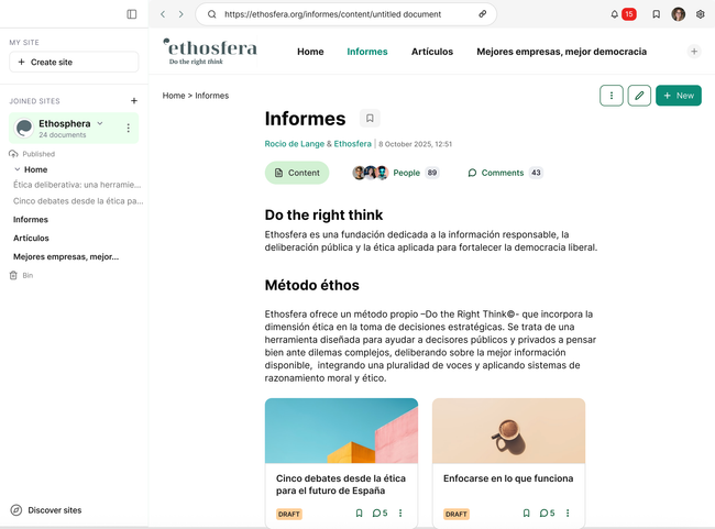
New structure layout with specific areas for each content and actions.
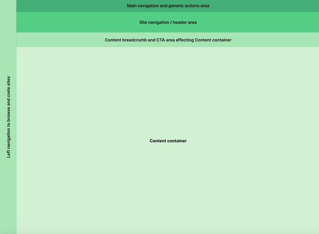
Create center container for content creation, edition and navigation.
Create top navigation for generic actions:
Account
Tool settings
Notifications
Access bookmark
Browse, share and navigate content
Create a left navigation to:
Create site
See list of sites you are subscribed to
See content organization (we need to see in detail how this behaves. See Notion example in Figma.
Discover other sites
Very clear CTA buttons -> Create new document together with secondary buttons: Edit and options (3 dots)
Limit the elements in the header. Treat them as sections even we don't mention it. Avoid weird interactions like arrow down when it doesn't fit the space
Change library for "Discover sites" and change what it is shown inside, we don't show again what user is subscribed to but we promote finding other sites. Discovery page to be designed.
Allow bookmark documents (parent and children). Create a section to see your list of all bookmarks from different sites. Bookmarks page to be designed.
TBC
Have a more clean with more space and whites interface that makes easy to read and find content.
Define specific options for document visualization, visual card versus compact.
Remove Subscribe button when you are already log in. Call it join or subscribe.
Join button is just shown when user is not logged in, after, it dissapears from the reader view.
It is just shown when editor is previewing what he/she is publishing.
User manages subscriptions on the 3 dots option next to the name of the site on the left column
It is crucial to have a clear CTA and right now the subscribe button is messing with this.
Document creation
Do you like what you are reading? Subscribe to receive updates.
Unsubscribe anytime