


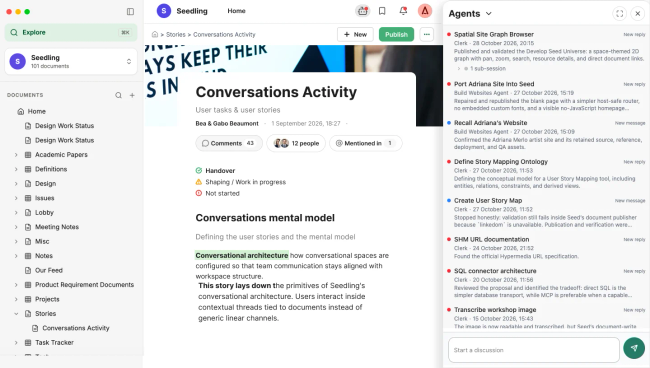
@Untitled Contact @Untitled Contact @Untitled Contact I am working on making all the space related tools accesible from the right panel and consistent in the way they open and close.
This affects how users access to Agents. There are many UX improvements I'd like to do with this but let's start with:
Change the access icon to the same you see when opening the tool (bot). This will make it consistent and will avoid confusing the tools with comments.
When opening the panel: keep the close and expand icons as in conversations in the right side. Now is very difficult to understand how to close.
Remove this bubble with the + , what is it? .
Make the inbox and the send icon consistent with comments
@Untitled Contact as commented shall @Untitled Contact do this? or who?
Do you like what you are reading? Subscribe to receive updates.
Unsubscribe anytime