


General findings to based the workshop on:
1. Core value proposition is undiscoverable
Seed's key differentiators — referencing, commenting, author control — are all interaction-triggered. New users stay in read-only mode and never take the action that would reveal them.
2. Content reads as passive, not interactive
Nothing in the visual design signals that content can be acted on. It looks like an article, so users treat it like one.
3. Onboarding guidance vs. clean reading experience
Onboarding cues risk cluttering the reading experience; a clean page risks leaving users lost. This needs a deliberate solution (e.g. progressive disclosure, dismissible first-use hints) — not a tradeoff resolved by picking one side.
4. Passkey-only auth is a hard blocker
Every demo user failed to complete account creation. Two distinct causes:
Some distrust device-bound credentials
Others don't have the mental model for passkeys at all
Expect email + code only or Password as a parallel option, not a fallback.
5. Homepage lacks orientation
The homepage prioritizes navigability over context. First-time users need a brief intro and visible content structure to understand what the site is before they're asked to navigate it.
6. Is this a site builder?
Solutions to explore and sketches:
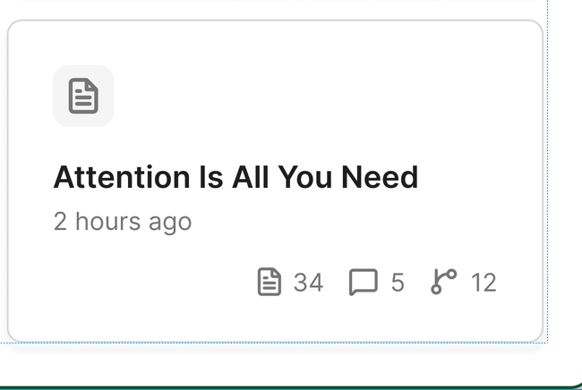
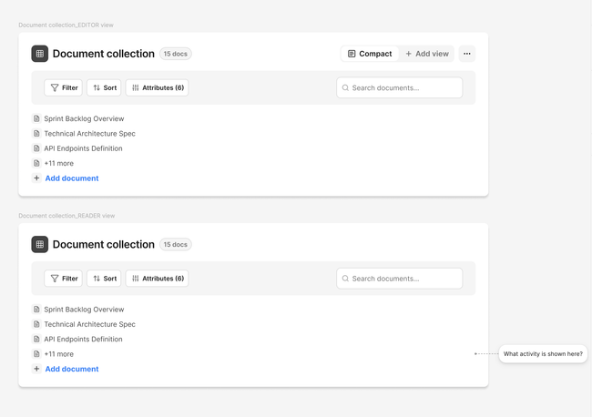
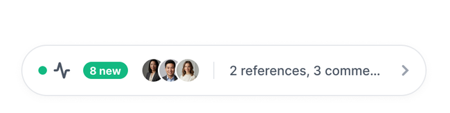
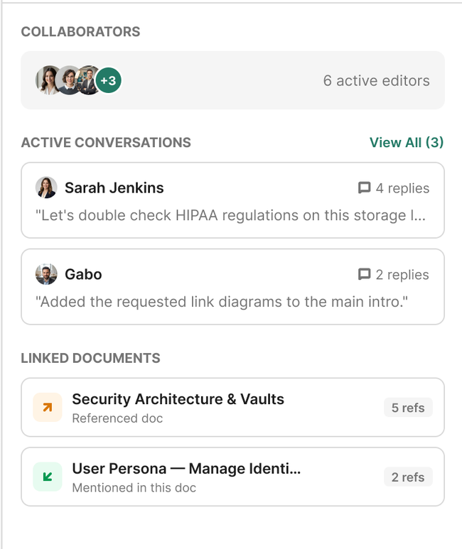
Show activity and main Seed features
On documents
On document collections
On the whole layout
What we do to activity tab?
HMWs?
How might we make a Seed Space look active and easy to know where to act?
How might we make easy to understand for new users what is Seed about?
How might we new users discover Seed features and differentiators easily?
Show there is people collaborating
Show Seed more to make it possible to discover and create site

Layout organization:
Where we should move this access to make this tools more visible and accessible? (desktop)
How its show in browser
Do you like what you are reading? Subscribe to receive updates.
Unsubscribe anytime